
The challenge
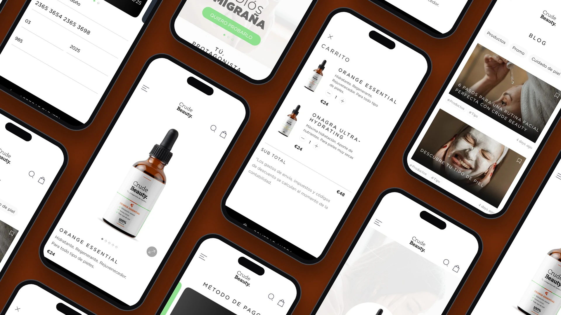
Create an attractive, youthful and clean design on a limited budget, on a par with the competition, that would draw in new users, influencers, investors and partners.
Design process
I followed a user-centred process, from research to a validated prototype.
Empathize
- Research
- Competitive analysis
- Personas
Define
- Solution
- MVP
Ideate
- User flow
- Wireframe
Prototype
- Branding
- High-fidelity prototype
Test
- User testing
- Conclusions
Competitive analysis
I analysed the websites of three benchmark brands, The Ordinary, La Roche-Posay and Kiehl's, to find out which features people expect from a cosmetics store.
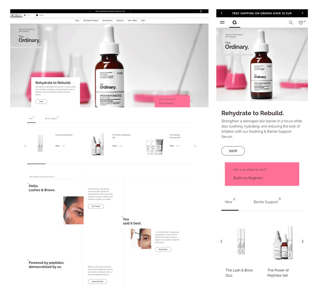

- Product banner
- Product image gallery
- Shopping cart
- Recommendations and reviews
- Sign-up and personal account
- “About us” section
- Newsletter
- Store locator
- FAQ
- Careers page
- Social media profiles
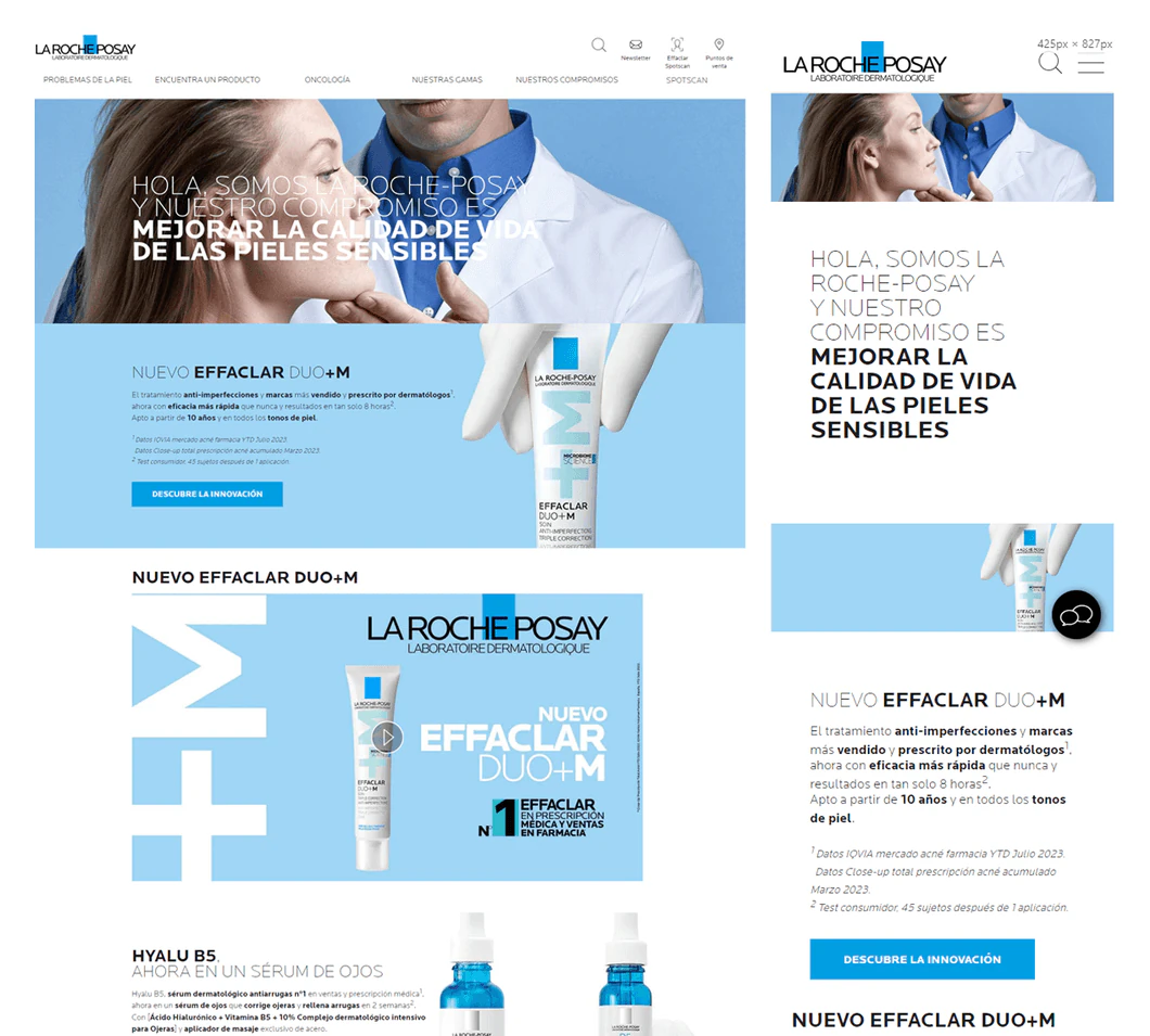
- Product banner
- Promotional banner
- Shopping cart
- Recommendations and reviews
- Sign-up and personal account
- “About us” section
- Newsletter
- Store locator
- FAQ
- Product videos
- Social media profiles
- Clean interface
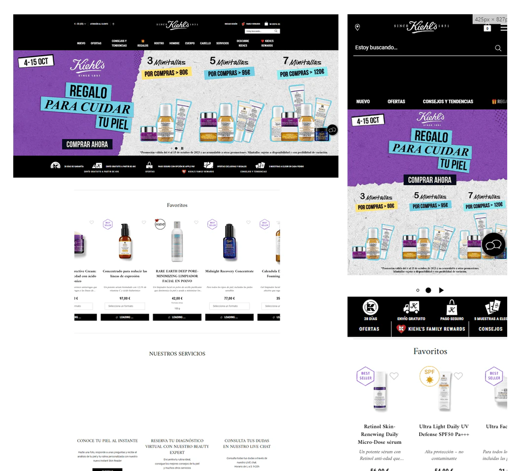
- Product banner
- Promotional banner
- Shopping cart
- Recommendations and reviews
- Sign-up and personal account
- “About us” section
- Newsletter
- Store locator
- FAQ
- “Virtual diagnosis” section
- Social media profiles
- Downside: Interface crowded with information, elements and colours
User persona
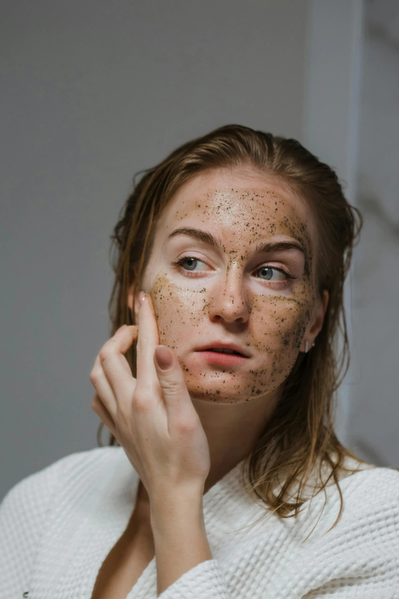
María Morales
- Age
- 28
- Location
- Madrid, Spain
- Marital status
- Single
- Education
- Language and Literature
- Occupation
- Language teacher
- Income
- €24,000 gross per year
She teaches English and French at a language school. She looks after her skin with a skincare routine and shares the products she discovers on social media.
Motivation
She sees skincare as an important part of her health and wellbeing.Needs
Quality products that keep her skin healthy and are safe to use.Fears
Using a product the wrong way and suffering lasting damage, such as dark spots or irritation.
How does María buy her beauty products?
She does her research before buying: she reads online reviews, checks the ingredients and considers what her skin needs. She also follows bloggers and experts for recommendations.
The solution
A fresh, youthful look
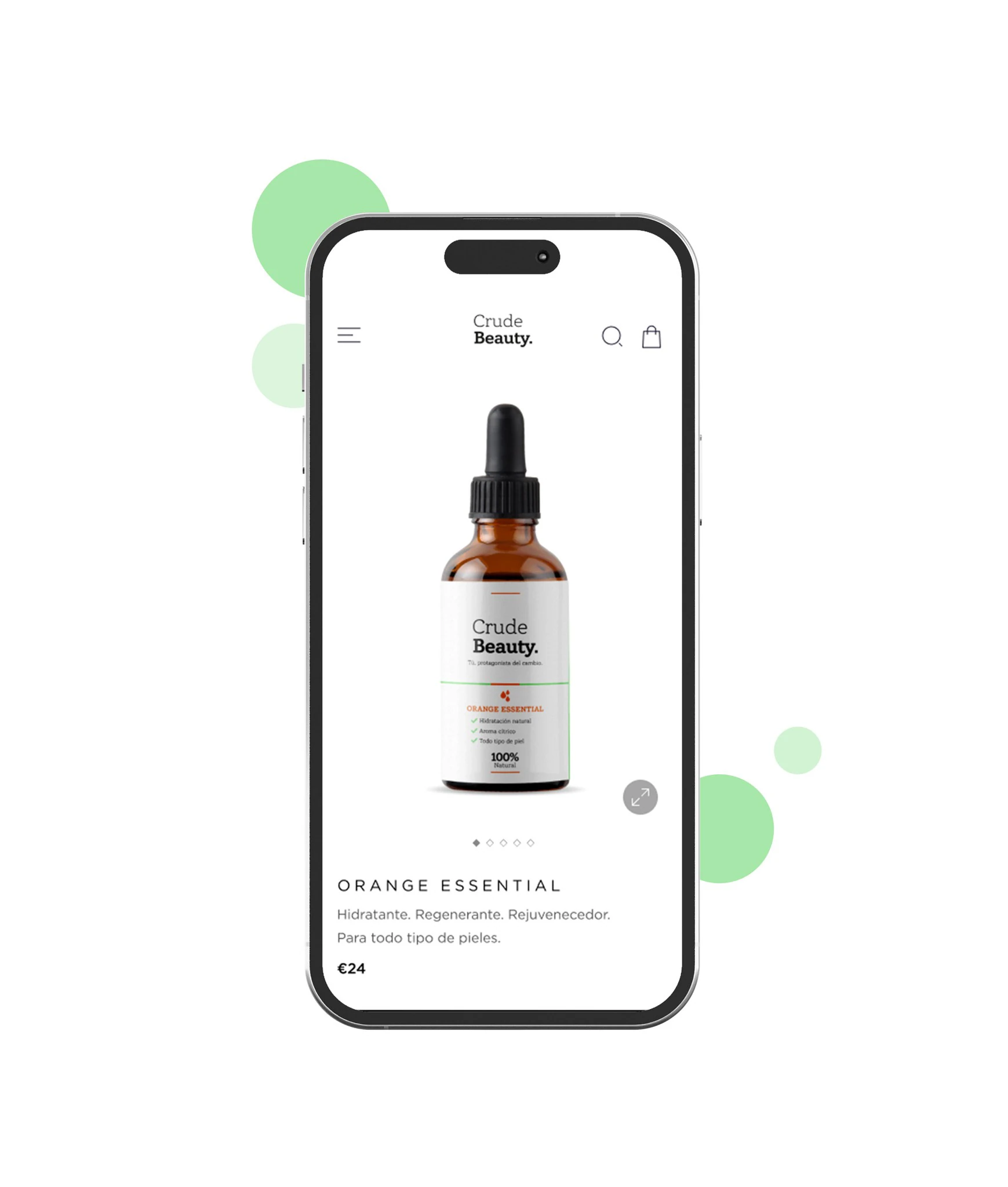
I created a new logo and designed packaging that reflects the brand identity.A website that sells
Eye-catching banners, oil recommendations by skin type and a shopping cart.An MVP to learn fast
Launch as soon as possible with the minimum features needed to attract the first users and validate improvements with the least effort.
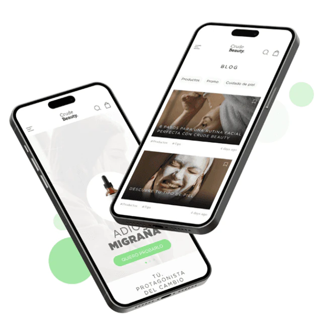
- Product banner
- Promotional banner
- Shopping cart
- Blog
- Social profiles
- “About us” section
- Clean interface
Branding
The logo combines two words in an elegant, natural typeface, split over two lines for visual balance and finished with a full stop.
Colours
- Pantone 2268 C
C49 M0 Y65 K100 · R121 G217 B124 - Pantone Neutral Black C
C10 M0 Y0 K100 · R0 G0 B0
Typography
- Headings
- Gotham Book
- Subheadings
- Gotham Book
- Body text
- Gotham Book
- Prices
- Gotham Medium
Iconography
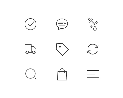
I chose an icon set true to the brand’s look to keep the appearance consistent across the whole product.
Prototype
Explore the interactive prototype and discover everything the interface can do.
Conclusions
Testing the solution confirmed a solid strategy to put CrudeBeauty on the map. The fresh, youthful look, the new logo and packaging that captures the essence of the brand laid the foundations of a vibrant, appealing visual identity.
The website, with captivating banners and a shopping cart, is a solid platform to attract the first customers. Conceived as an MVP, it brings together a basic but effective set of features that made it possible to go to market in record time.
Gathering feedback from day one will make it possible to adjust and extend the features to customers’ real needs, ensuring continuous growth and a great user experience.