
The challenge
Getting a medical appointment causes stress, anxiety and lost time, especially when you’re left waiting on a call. The centre only offered phone bookings.
During research I focused on improving patients’ experience when booking an appointment at the centre’s branches. My goal was to find a way to improve the appointment system and create real synchronisation between patient and specialist.
Goals
- Improve the centre’s appointment system, which today only works over the phone.
- Understand patients’ real needs before proposing a solution.
- Go beyond the appointment: give each patient a place to keep track of their health.
Research
I wrote an interview guide from an umbrella of ideas with three axes: patients’ behaviour, their needs and their attitudes towards online healthcare.
Behaviour
- How often do you book a medical appointment?
- Do you call to book your appointments?
- How long have you waited on those calls?
- Do you use an app for your medical visits?
Needs
- Do you need to track your appointments on your device?
- Do you keep a record of past appointments?
- How do you keep track of your appointments today?
- How is your doctor–patient relationship?
Attitudes
- What do you think about online healthcare?
- Would you book your next appointment online?
- Would you keep track of your health in an app?
- Have you had a bad experience booking online?
First observations
- “I don’t track my health, but I’d like to start and have my medical history available.”
- “The public system doesn’t offer many ways to track your health: I have no idea when my gynaecology check-up is.”
- “Some online health apps are very basic.”
- “I always book restaurants online.”
Benchmark
I analysed public and private appointment apps, such as the Community of Madrid’s health appointment app and HM Hospitales’, to understand what patients expect from a health app.
Insight
Insight: patients need to keep track of their medical appointments by specialty, in a practical way that is always at hand. A medical diary.
To make it actionable, I tested it against four questions: does it inspire? Is it new? Did we learn something? Does it address the business problem?
The proposal
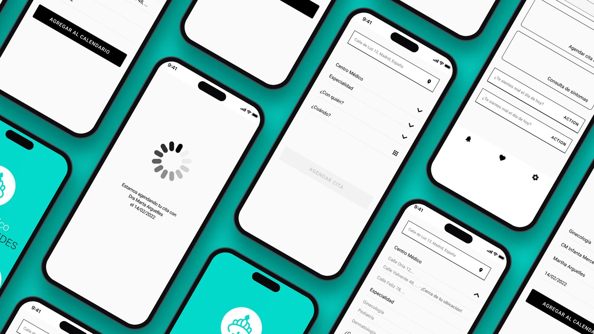
An easy-to-understand online appointment system, organised by specialty, with access to the medical history from the device the patient uses every day.
User personas
With what I learned in the interviews, I defined two user personas who represent patients needing ongoing medical follow-up.
Lydia Marín
- Age
- 40
- Occupation
- Primary school teacher
- Family
- Husband and two daughters
- City
- Madrid
She balances her health, work and family while managing her diabetes, under the pressure of medical costs and day-to-day fatigue.
Goals
Manage her diabetes effectively without neglecting her family or her job.
Frustrations
The time and effort her treatment demands, and the financial burden of medical costs.
Gema Piceli
- Age
- 29
- Occupation
- Human resources
- Family
- Lives with her sister; parents live away
- City
- Madrid (born in Burgos)
She lives with a thyroid imbalance that affects her energy. She works hard to look after herself without falling behind at work.
Goals
Follow her thyroid treatment plan and stay close to her family despite the distance.
Frustrations
The fatigue caused by her condition and not being near her parents at important moments.
User flow
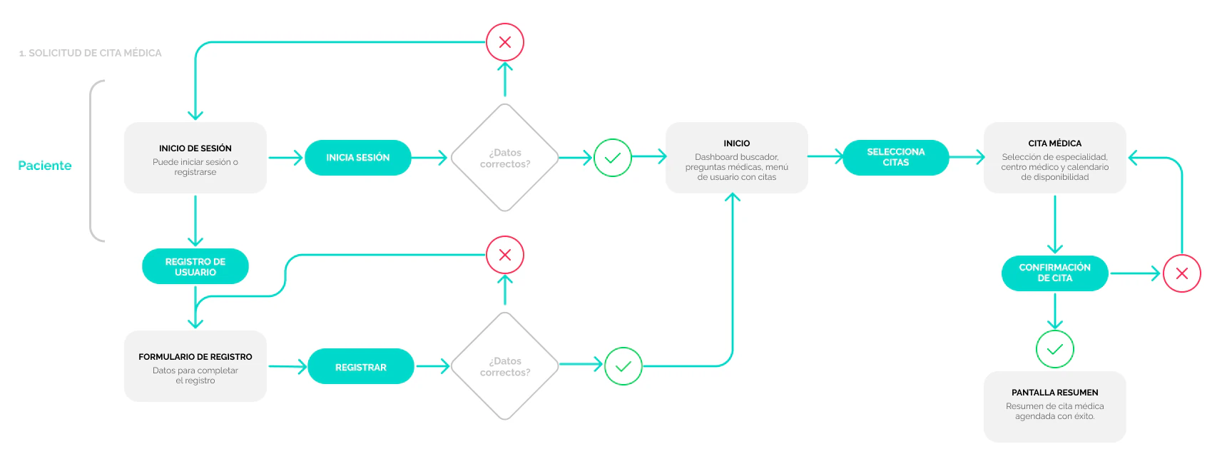
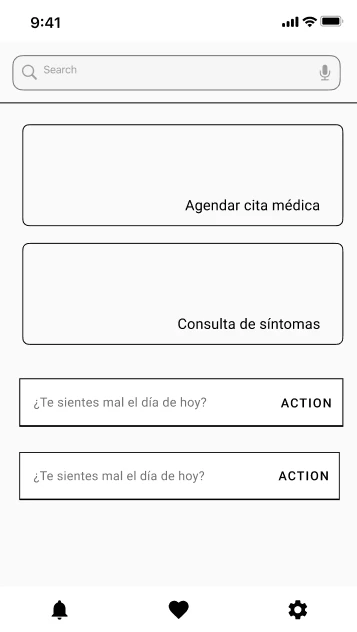
The main flow is booking an appointment: the patient signs in or registers, lands on a home screen with search and shortcuts, chooses specialty, centre, specialist and date, and gets a summary of the appointment.
Access
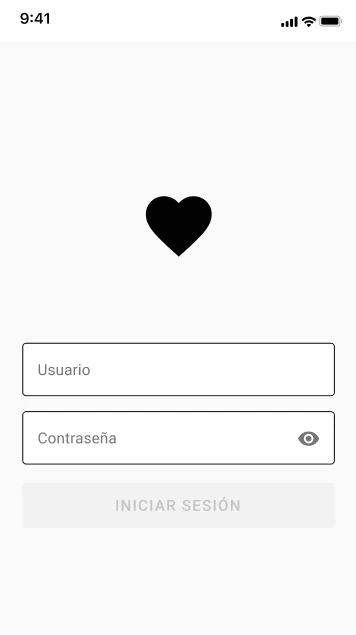
- Sign in
- Registration with data validation
Home
- Search
- Book an appointment and symptom check
Appointment
- Nearest centre
- Specialty, specialist and date
Confirmation
- Appointment summary
- Add to calendar
Wireframes and design
To present the proposal I turned the flow into low-fidelity wireframes, showing the app’s structure before the visual design. The booking form unfolds step by step and suggests the centre closest to the patient’s location.
Wireframes
 Sign in
 Home
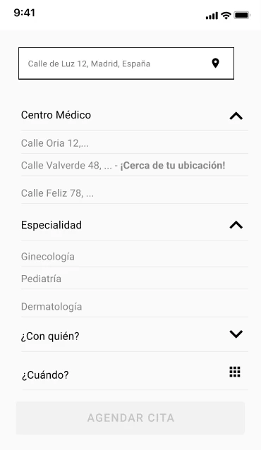 Centre and specialty
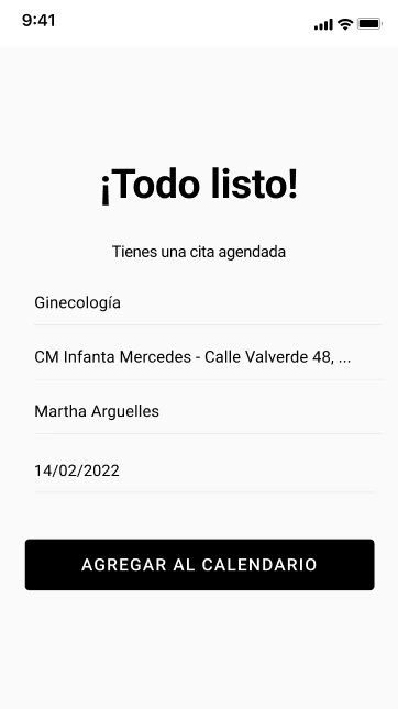 Appointment booked
Visual identity
The interface builds on the centre’s identity: a calm, bright healthcare turquoise and a logo that joins a crown with the medical cross. I designed the sign-in screen in high fidelity so the centre could see how its app would feel.
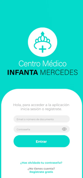
The pitch
This discovery work was the basis for pitching the project to the medical centre: the research, insight, personas and flow proved the problem and shaped the solution. The proposal included a roadmap for the next phase:
Validate with patients
Test the booking flow with patients like Lydia and Gema before investing in visual design.High fidelity
Take the full flow to high fidelity with the centre’s identity.Medical diary
Design the medical history and tracking by specialty: the heart of the insight.